Central Library - Rotterdam
The Central Library of Rotterdam is one of the city’s most iconic buildings, easily recognizable by the large yellow pipes that are reminiscent of the Centre Pompidou. This city landmark from the early 1980s was designed by Van den Broek & Bakema. A design team consisting of Powerhouse Company, Atelier Oslo, Lundhagem, DELVA Landscape Architecture | Urbanism, Buro Happold and ISIS Bouwadvies was selected by the City of Rotterdam and the Rotterdam Library Foundation to breathe new life into this iconic structure.
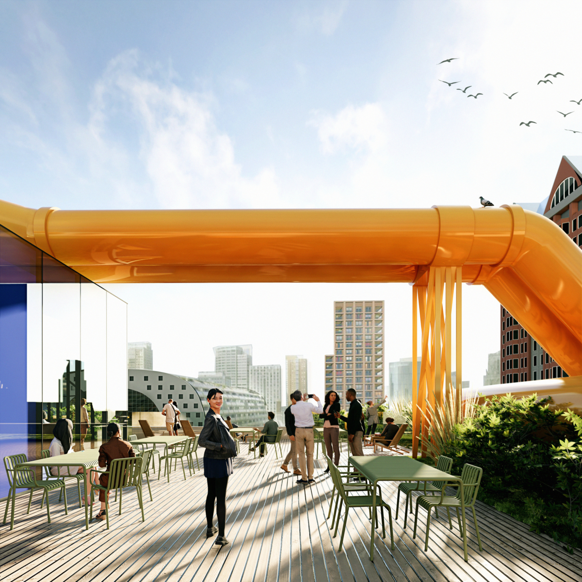
The new design is a model of radical reuse where a 1980s building transforms into a future-proof, contemporary library as the result of the expertise combination led by Powerhouse Company, Atelier Oslo and Lundhagem. The two Norwegian firms were responsible for the design of the Deichman Library in Oslo (voted the world’s best public library of the year 2021).
As part of the library’s transformation, the surrounding outdoor space will also be reimagined, with the area between the building and the ‘Cube Houses’ undergoing the most significant changes. This will create more space for greenery and establish an inviting area, that is connected to the library’s activities.
DELVA is transforming the outdoor space into a pleasant, green environment that connects with the surrounding neighborhood and fosters an engaging relationship with the activities taking place inside the library.
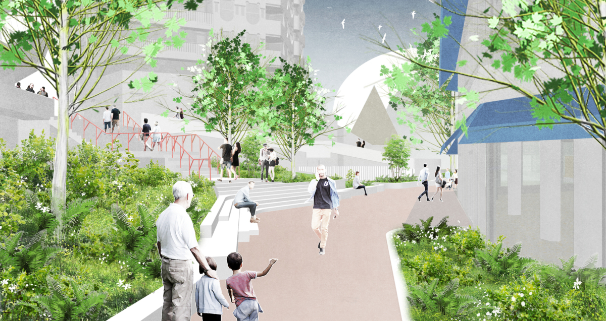
The Rijstuin: from an invisible space to a green oasis
The library will establish a clear connection with the Rijstuin, bringing it out of anonymity and creating a link with its surroundings. From Binnenrotte, the Rijstuin will become visible and accessible, serving as a green oasis and a space for relaxation between the CBR and the ‘Cube Houses’.
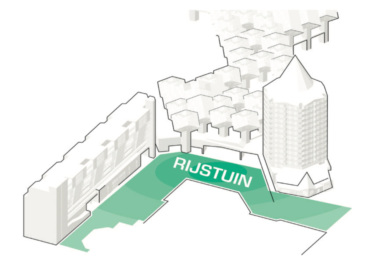
The currently fragmented and paved space will be redesigned as a cohesive whole, with materials and planting zones flowing seamlessly into one another. This transformation will enhance the connection between the Rijstuin, the library, and its surrounding area, offering a unified, welcoming green space.
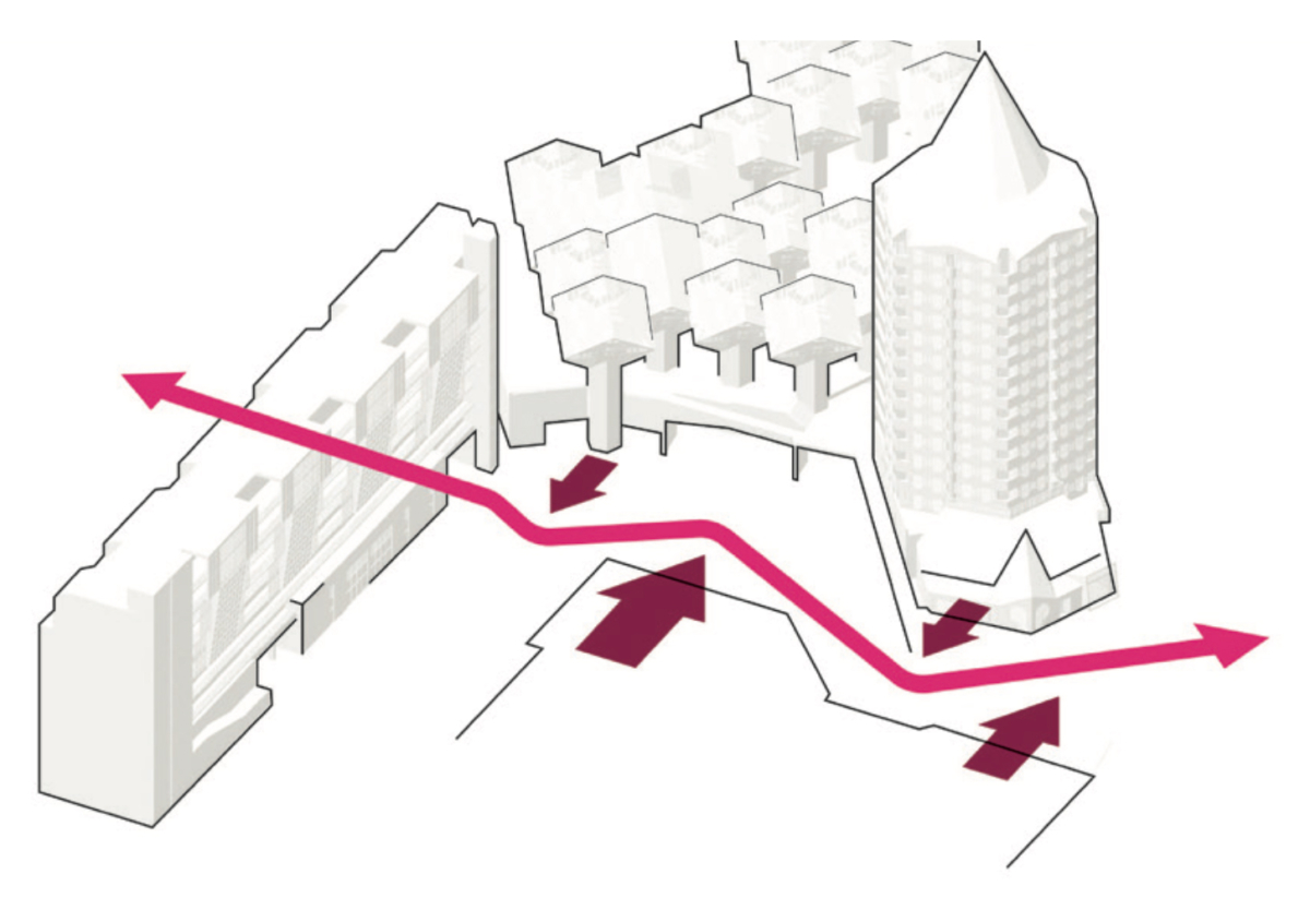
A welcoming pathway will be created between Binnenrotte and Mariniersweg, meandering through the Rijstuin. The route will feature subtle curves, transforming the connection into an engaging walk rather than merely a functional passage.
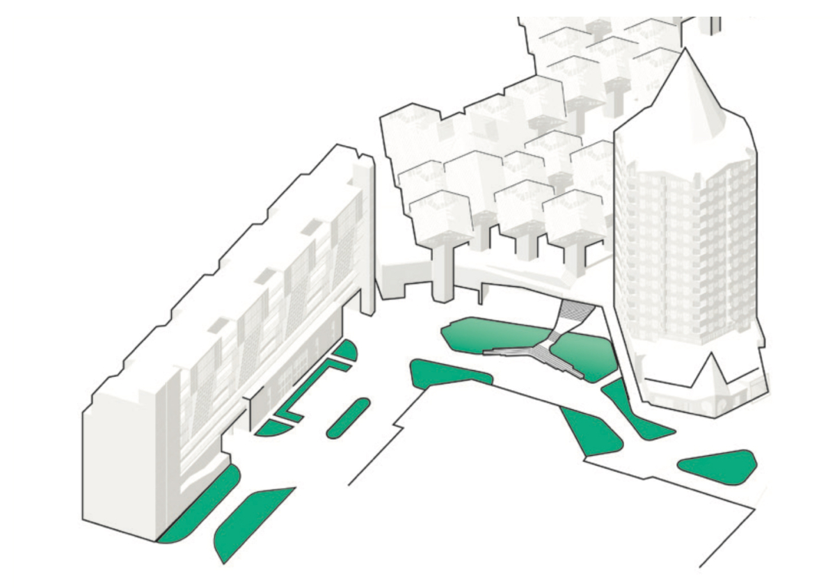
The Rijstuin will undergo radical greening, with lush plant life guiding pedestrians through the space. The transformation will turn the currently paved area, which lacks any quality for lingering, into a pleasant environment where people can relax and enjoy the city.
The future of the Central Library of Rotterdam is public: accessible and open to everyone. The boundary between indoors and outdoors will be blurred. – Rogier Hendriks
Restoring the vision
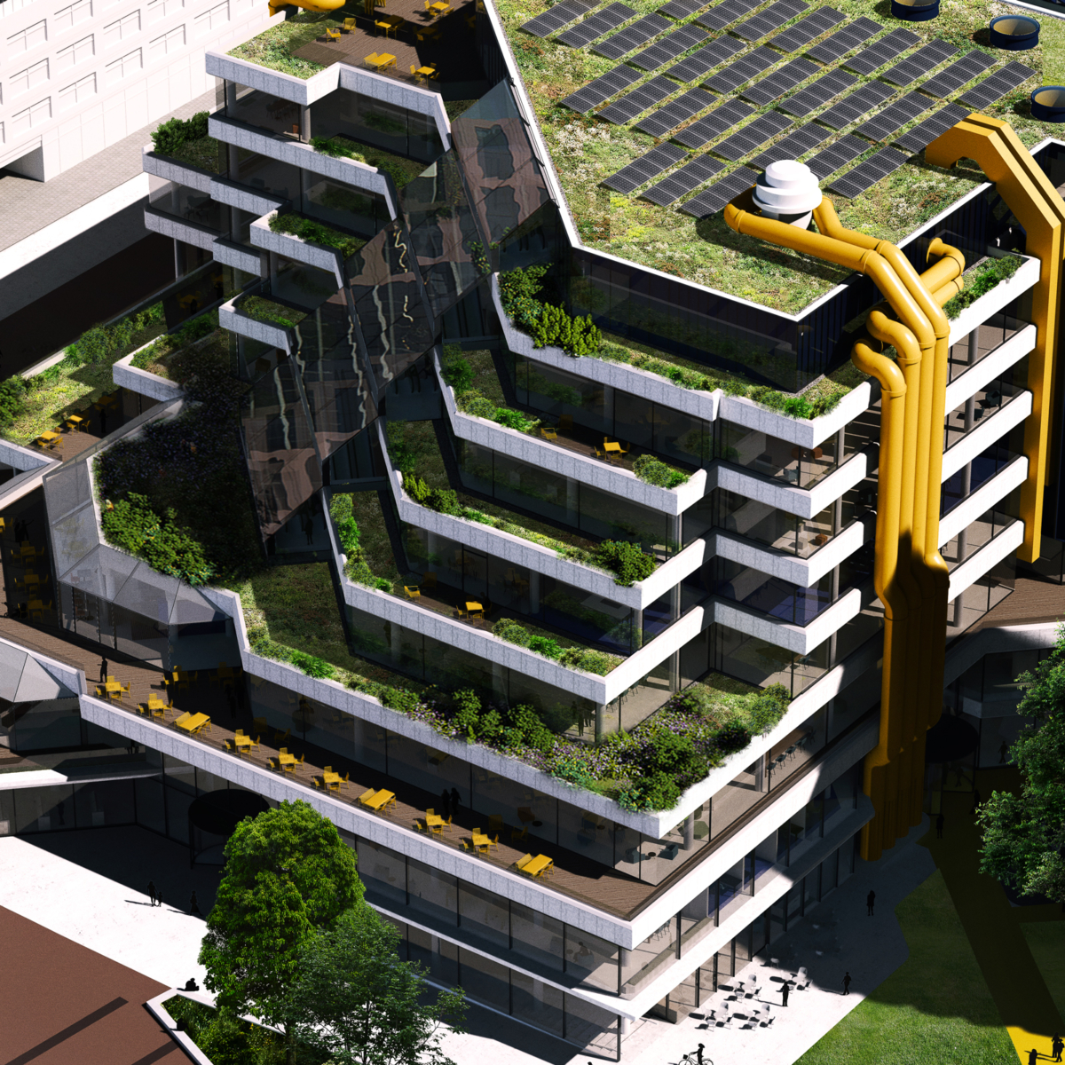
The new Central Library design seeks to improve the use of glass to create a light, fluid and spacious experience, with unobstructed views to the outside. The lower intersecting escalators were positioned differently in the implementation, which compromised the rhythm of the design. The new design corrects this and also improves connectivity by adding large wooden grandstand stairs between floors.
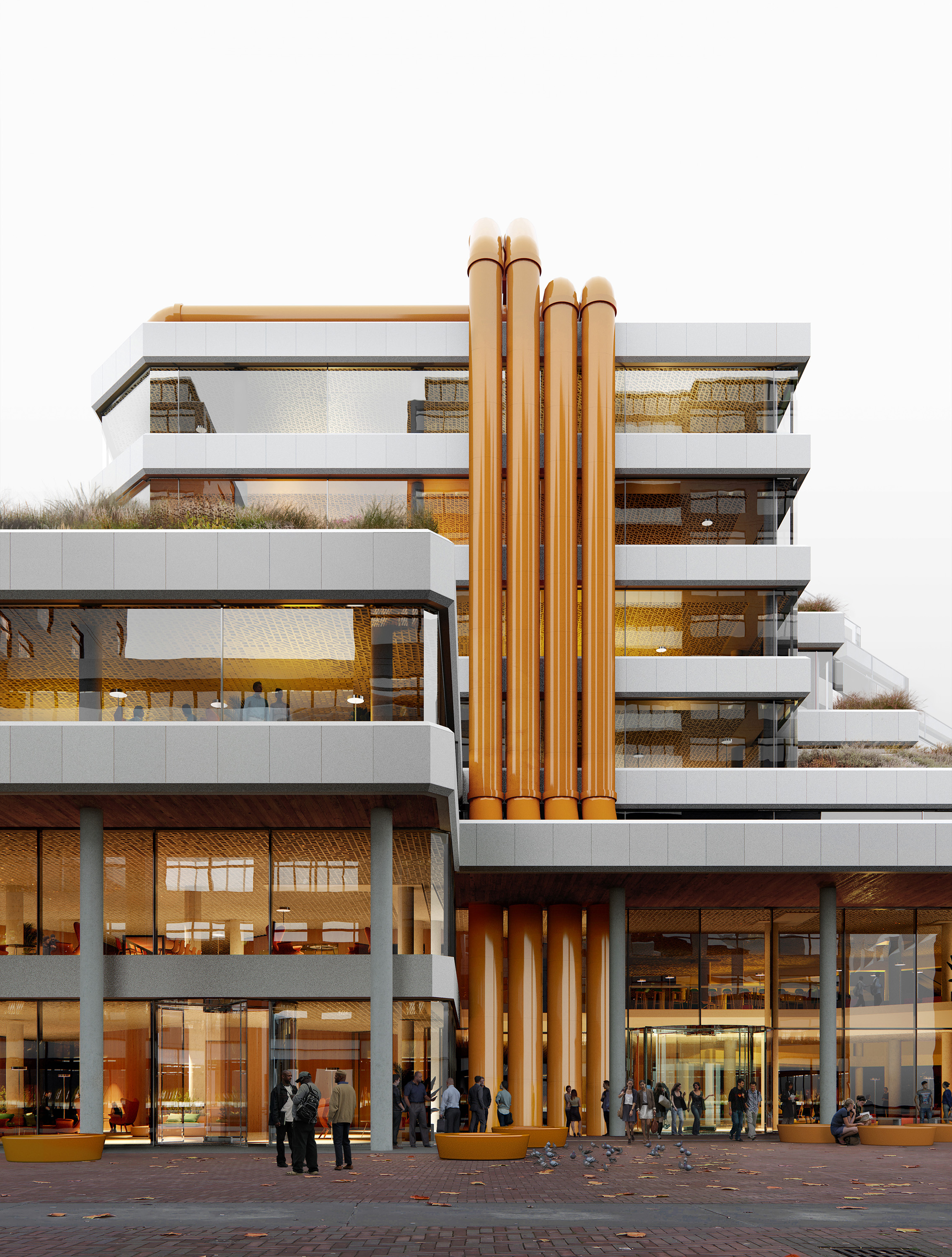
The yellow tubes, originally intended for air treatment, will be retained, albeit in a more sustainable way. In addition, the iconic tubes are used as multifunctional elements and extended to the ground. This makes them part of the streetscape, tangible and approachable, and even more part of the building’s identity. Additional floor space, as well as light and transparency, are added by a new, glazed volume with wooden construction at the back of the library – in blue, just like the former storage room it replaces. This means the library will retain its colour signature, with white, yellow and blue. The new extension thus combines contemporary circularity with the eccentric language of the original building.
Making an entrance
The library’s existing main entrance seems far removed from the heart of the library. To improve this, the new design adds entrances on all sides, centrally located in each facade. These entrances enhance the accessibility of the ground-floor space and integrate well with the surrounding city, transforming the library into a true ‘living room of the city’. The corner of the square will be transformed into an inviting public terrace.
Inside, the interior has an intimate, relaxed and homely atmosphere. The various interventions to transform and extend the building create a succession of spaces that can accommodate a lively and flexible programme. This new layout makes it easy to oversee the diversity of programme: from rooms for cooking workshops to a climbing wall on the children’s ward. This sequence of spaces completes itself on the seventh floor, with a green, quiet reading room on one side, and terrace with stunning views of the city on the other – the (literal) highlight of the journey through the building.
- Location
- Rotterdam
- Status
- Sketch design
- Client
- Municipality of Rotterdam
- Together with
- Rotterdam Library, Powerhouse Company, Atelier Oslo, Lundhagem, Buro Happold, ISIS Bouwadvies